OPENING
FRIDAY 01.03.19
19:00 – 22:00
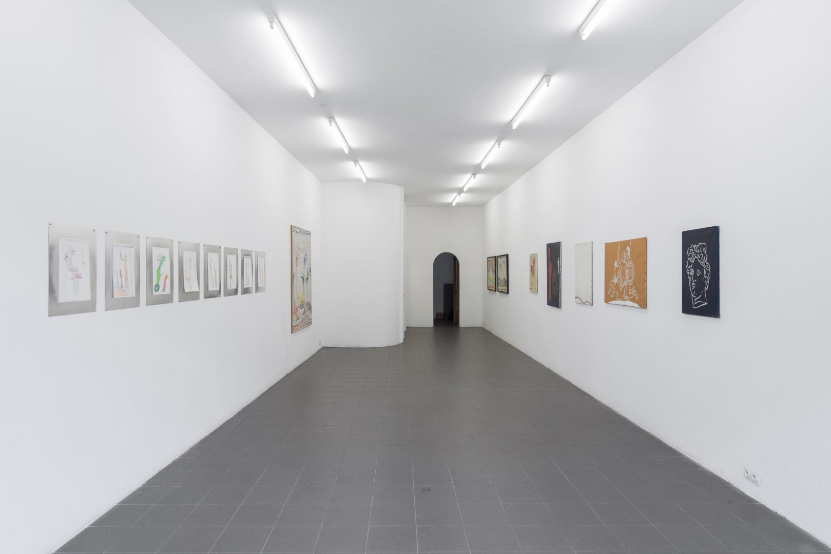
EXHIBITION
02.03.19 – 05.05.19
WED-SUN / 14:00 – 18:00
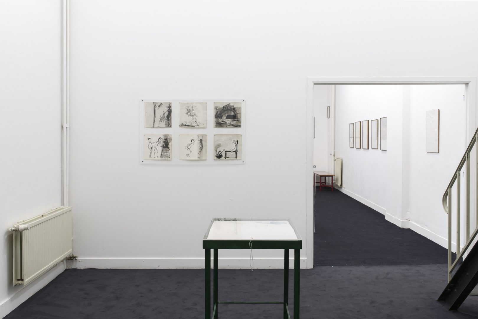
CURATED BY LILOU VIDAL
Could it be that a job other than the one undertaken at the studio is able to define the intrinsic principle of the artist’s work rather than hinder its development? The book and the printed page as an editorial endeavour, object of research, space of production, of collaboration and of visual and artistic experience is what lies at the origin of Ezio Gribaudo’s work.
Trained at the Brera Academy of Graphic Arts in Milan and at the Polytechnic Faculty of Architecture of Turin, Ezio Gribaudo (born in Turin in 1929) began a career as an artist while engaging in activities dedicated to typography, printing and publishing. In 1955, at twenty-six, he began working as a draftsman at the famous Nebiolo foundry factory (1) and developed his taste for typefaces and printing machines. He learns to arrange the characters on the page while focusing on new industrial printing technologies. Four years later, in 1959, he is invited to head the Fratelli Pozzo Moncalieri company in Turin (initially specialized in the printing of railway schedules), which he soon turned into a publishing house dedicated to art books under the name Edizione d’Arte Fratelli Pozzo.
In the context of this Piedmontese industrial revival, the artist likes to recall the symbiosis of energy that existed between work and culture in the printing company where employees, artists and Ezio Gribaudo worked together with a shared passion and curiosity and experimented with new machines to become operators of the printed page. At the time of the development of offset printing, his friend Pierre Alechinsky writes him, “Perhaps I’ll have time to go to Turin in October to try the new machine, I’m very curious to see it, but at the same time, the four colours make me a little scared!”(2)
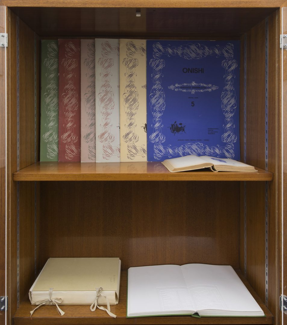
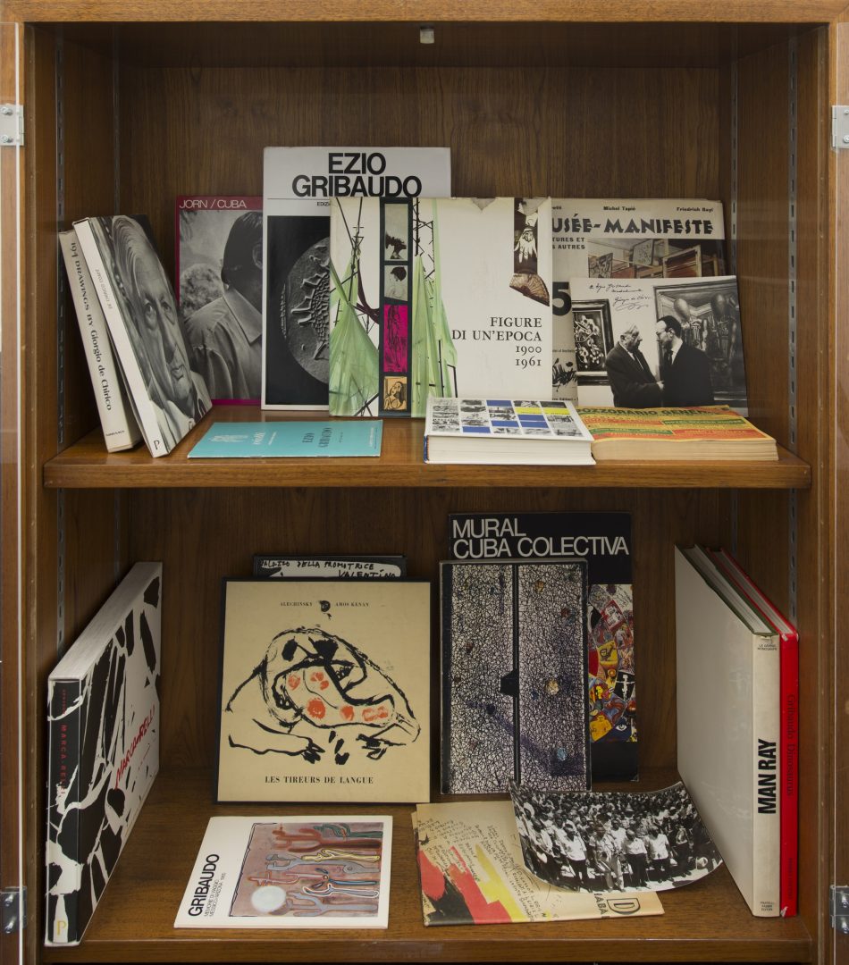
All of Gribaudo’s work evolves alongside his role as publisher and supporter of the artists of his time. In 1963, he starts to collaborate with editions Fabbri and publishes more than 30 monographs of artists from the international avant-garde (Le Grande Monografie) while collaborating with authors, critics, poets or other publishers such as Einaudi.
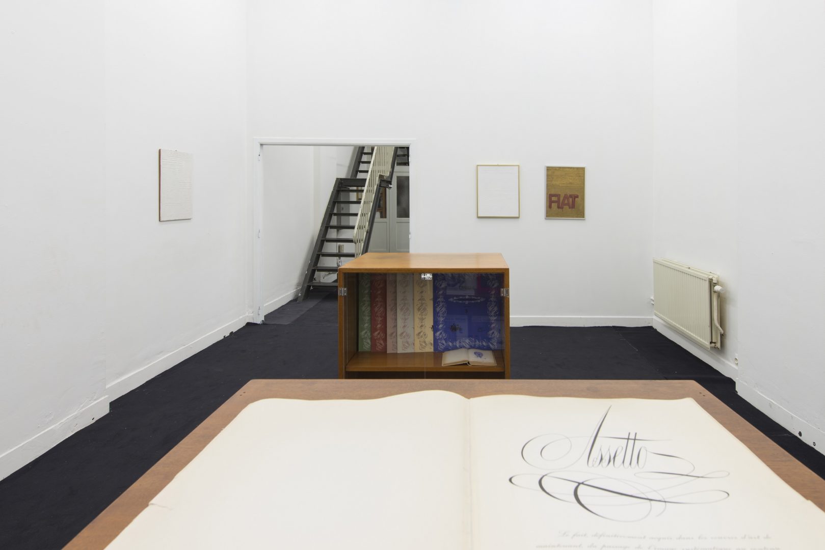
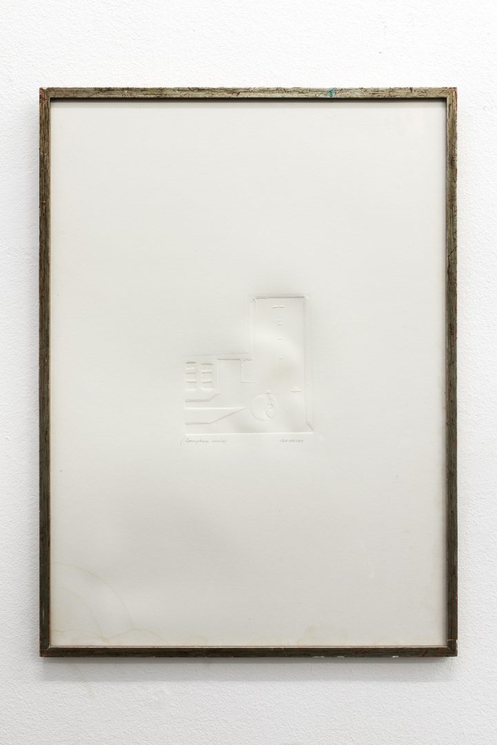
The book, Il Peso del Concreto edited by Ezio Gribaudo (Edizione d’Arte Fratelli Pozzo, 1968) is an example of this type of artistic, publishing collaboration. The artist invites one of the leading figures in experimental and sonorous poetry, Adriano Spatola, to conceive an anthology of concrete poems on the basis of black and white photographic reproductions (sometimes in macro) of his works in relief, the Logogrifo. A work in which the industrial material of text and image acts in a relationship of visual and tactile interdependence.
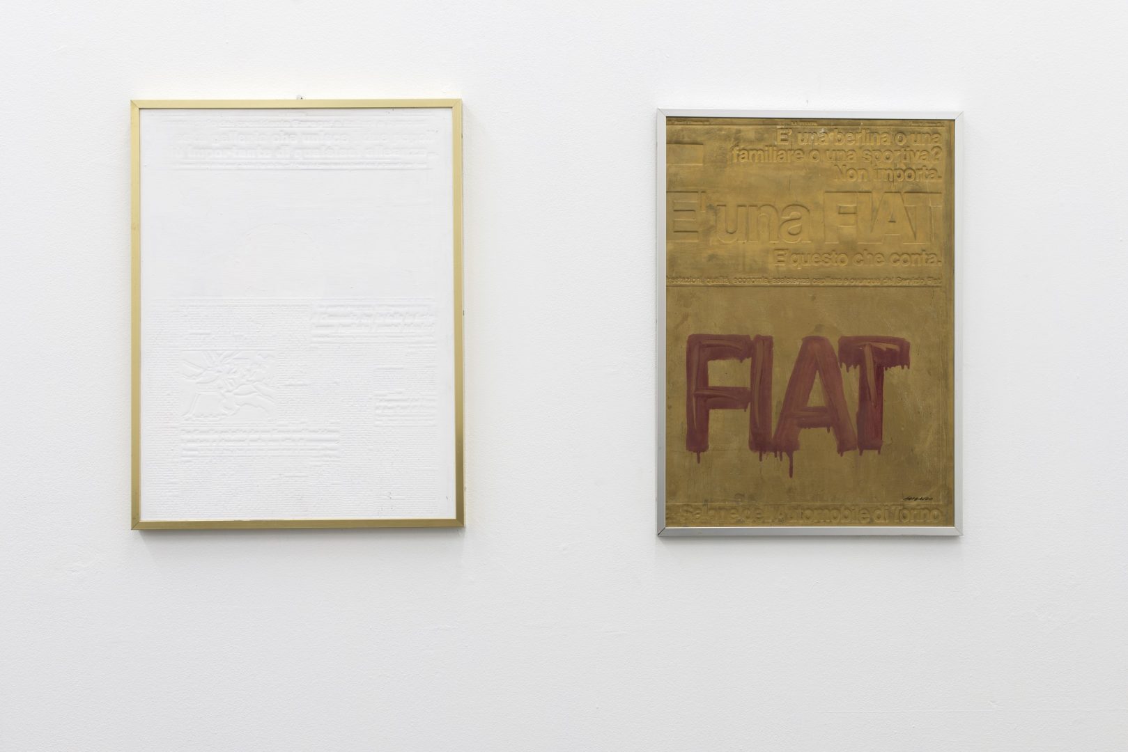
The relation between the image and the printed text physically affects the essence of the artist’s work. This will lead to the first Flano and Logogrifo, fruit of his activity as publisher, of his fascination with new industrial printing processes (monotype and linotype) but also with typographic characters and relief matrices. The Flano works, exhibited for the first time in 1961, are based on typographic printing plates (stereotypes) which were cast from flongs—papier mâché molds—and which allowed to make clichés that were adaptable to the printing cylinders of the presses used to produce most newspapers until the appearance of offset printing.
Gribaudo became interested in these postindustrial residual forms, these kinds of technological ready-mades, which he alters by erasing the original traces (ink and colour) by covering them in white. This neutrality echoes the concept of the blank page while the arabesques of the shadows of the reliefs reveal the negative forms of a printed page. In these white monochromes, the hierarchy between the text and the image of a page of the newspaper Stampa, for example, has disappeared, the text becomes image and the image becomes language.
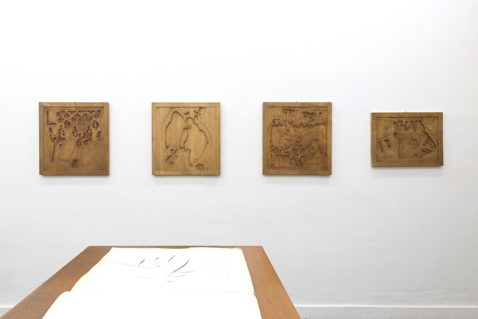
Ezio Gribaudo’s Logogrifo (3) belongs to an equivocal non-verbal entity: “The Greek ‘logos’ for speech and ‘grifo’ for fishing net is used for every enigmatic discourse that is intricate and hard to understand: more in particular, it is a sort of riddle consisting of verses, which consist of an equal number of enigmas to be figured out, and from which, once they have been guessed, letters or words must be drawn in order to form the solution to the main enigma. (4) ”
The logogriph is a syllabic or pictorial enigma, an anagram, a rebus or a puzzle. Technically it is made according to an embossing method applied to blotting paper, on the basis of the imprint of a matrix. These works—which earned him the Graphic Arts Award at the Venice Biennale in 1966, and the Sao Paulo Biennale in Brazil in 1967 —are of great precision and graphic sobriety. However, they thwart the rational rules of the universe from which they originate and maintain their poetic ambiguity through the original and anachronistic use of an associative process involving typographic forms. The result is a repertoire of white mnemonic forms, sometimes textual, sometimes figurative or topographical (even orographic), recalling the gravity of a concrete world that has become fictitious.
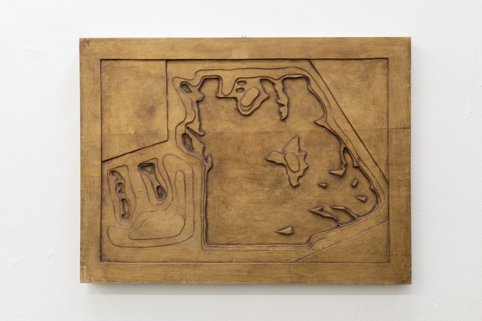
The relation to this corporality, this “weight of the concrete,” (5) and the imaginary is reflected in Gribaudo’s fascination with the iconography of dinosaurs. Upon entering Ezio Gribaudo’s brutalist-style studio in the via Biamonti in Turin (6), one discovers a whimsical world of sculptures of these prehistoric vertebrates made by the artist. Just before crossing the door, one comes across the fossilised imprint of a dinosaur body. The archetypal image of a trace, of the imprint both concrete and fantasized (since never seen by man) the bodily presence of the dinosaur emerges from the positive or negative shape of their absence. This subject reappears as a leitmotif in many works of the artist from the 80s onward, in the form of series of paintings, drawings, sculptures and Logogrifo.
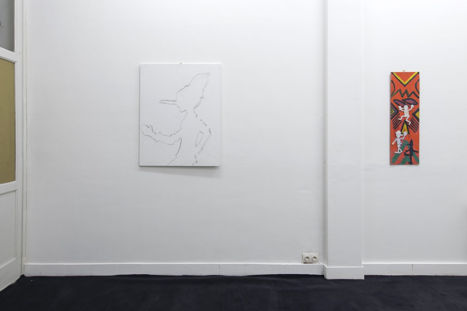
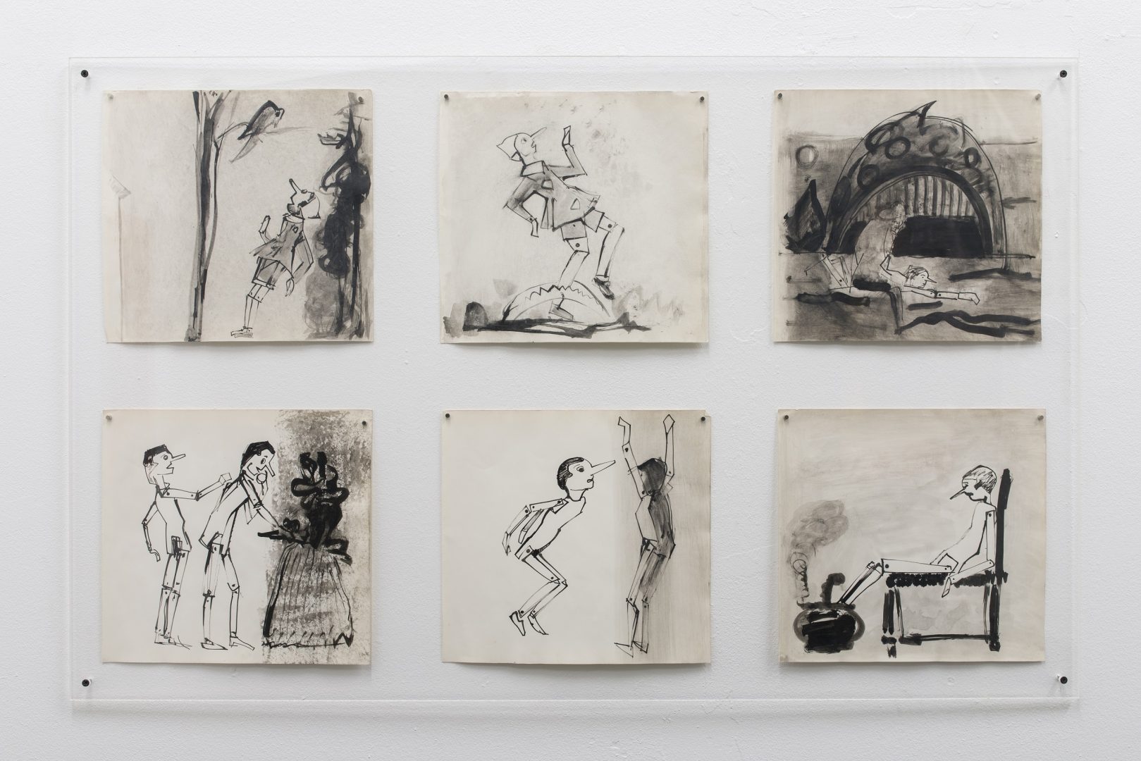
As early as the 1950s, Ezio Gribaudo creates a series of Indian ink drawings of Pinocchio, another favourite figure and subject of the artist. The character of Pinocchio also permeates several registers of his work, as if it were the moving matrix of a reproducible image. This wooden puppet invented by Carlo Collodi has become a model in itself. Apart from the different symbolic interpretations that spring from Pinocchio’s story, he embodies a subject in search of an identity and a social and political order. Born from the craftsmanship of a woodcarver, it is for Gribaudo a form that is shaped, reproduced, never ceasing to multiply without becoming anything other than itself. A prototype.
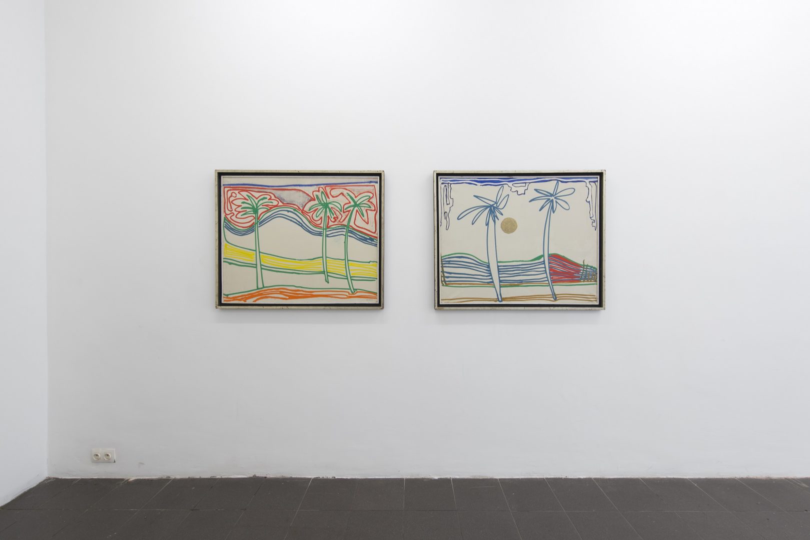
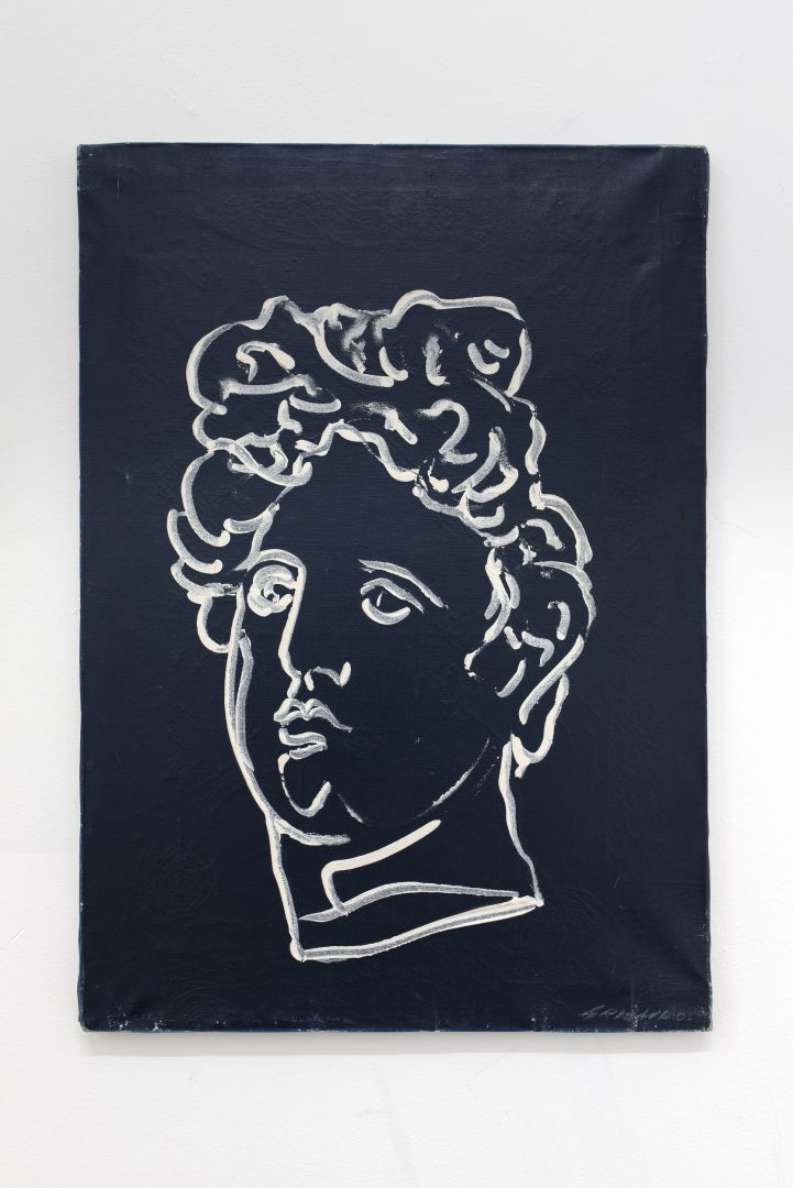
It is therefore not surprising that Gribaudo was also interested in the wooden mannequins of Giorgio de Chirico’s paintings. In 1968, Gribaudo realizes a series of 21 paintings as Homage to de Chirico. They are a reinterpretation in a Pop-like style of the work of a master of metaphysical painting. The latter will never cease to fascinate the artist and publisher Gribaudo who will dedicate three major books to him (7). The friendship towards de Chirico and the deep knowledge of his work becomes the fruit of new experiments. Decontextualized from their original pictorial framework, the subjects borrowed by Gribaudo from de Chirico’s work become graphic shapes painted with the direct virtuosity of the drawn line, set against neutral and monochrome backgrounds without any hierarchy of perspective. They are basically painted drawings, contours in relief, that have seemingly emerged from matrices of engraving plates. The tribute, the act of borrowing, also becomes an imprint.
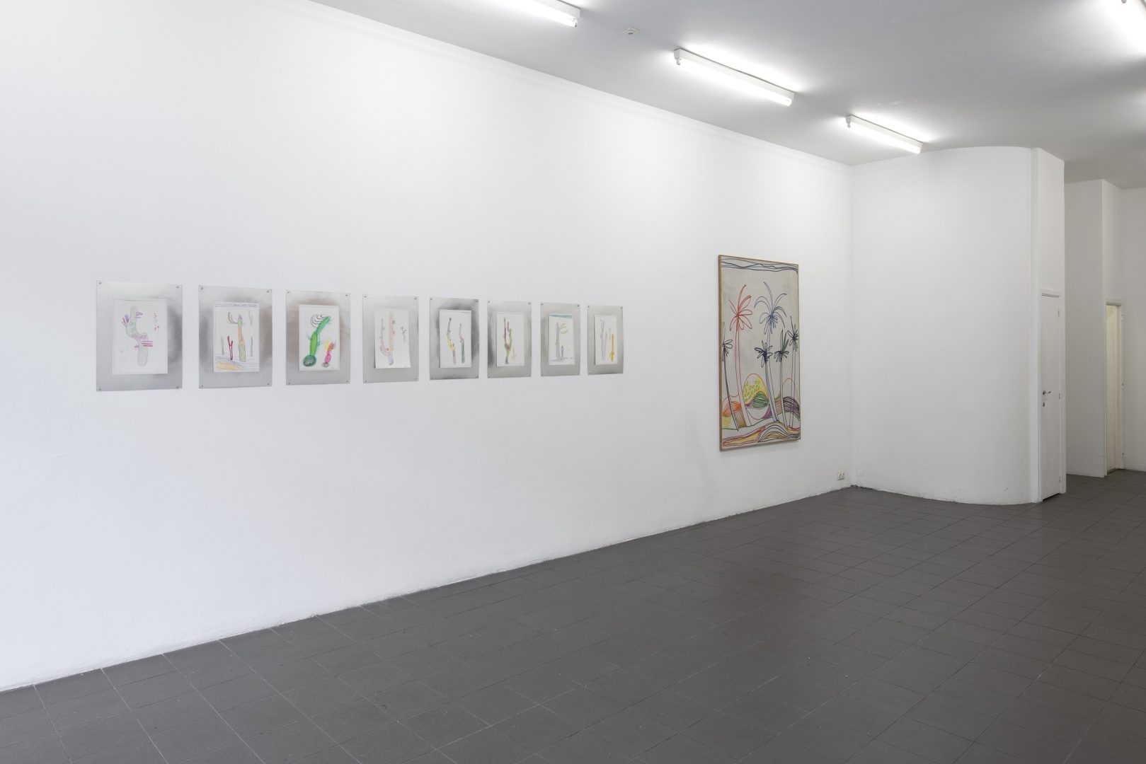
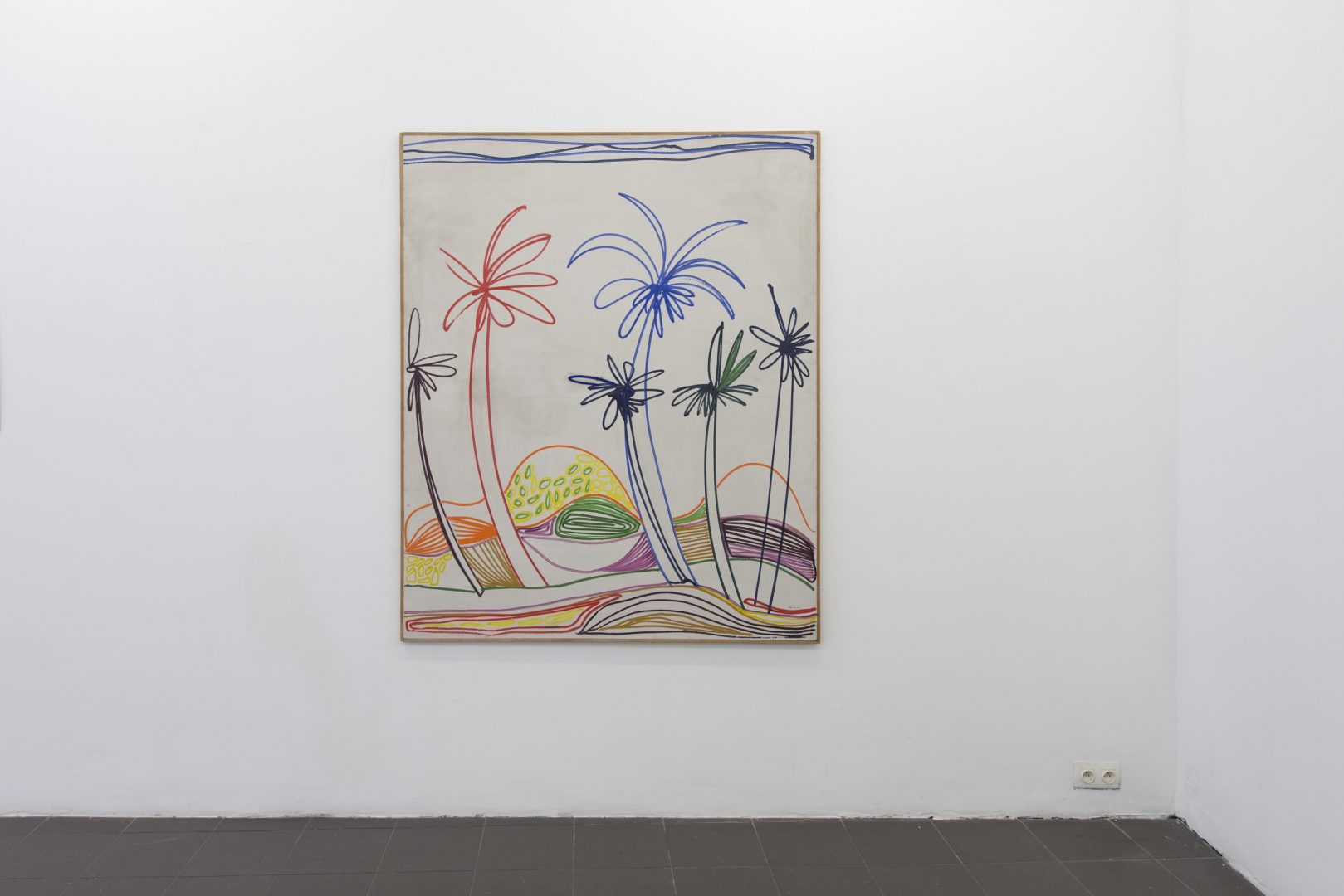
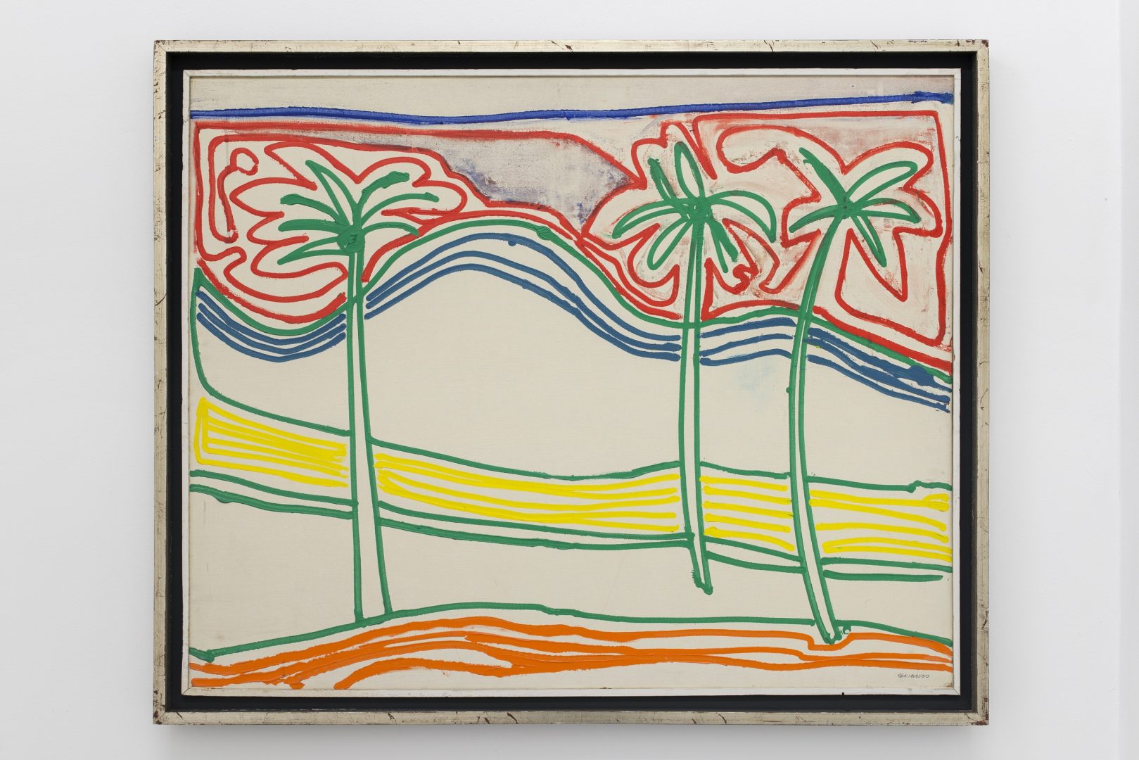
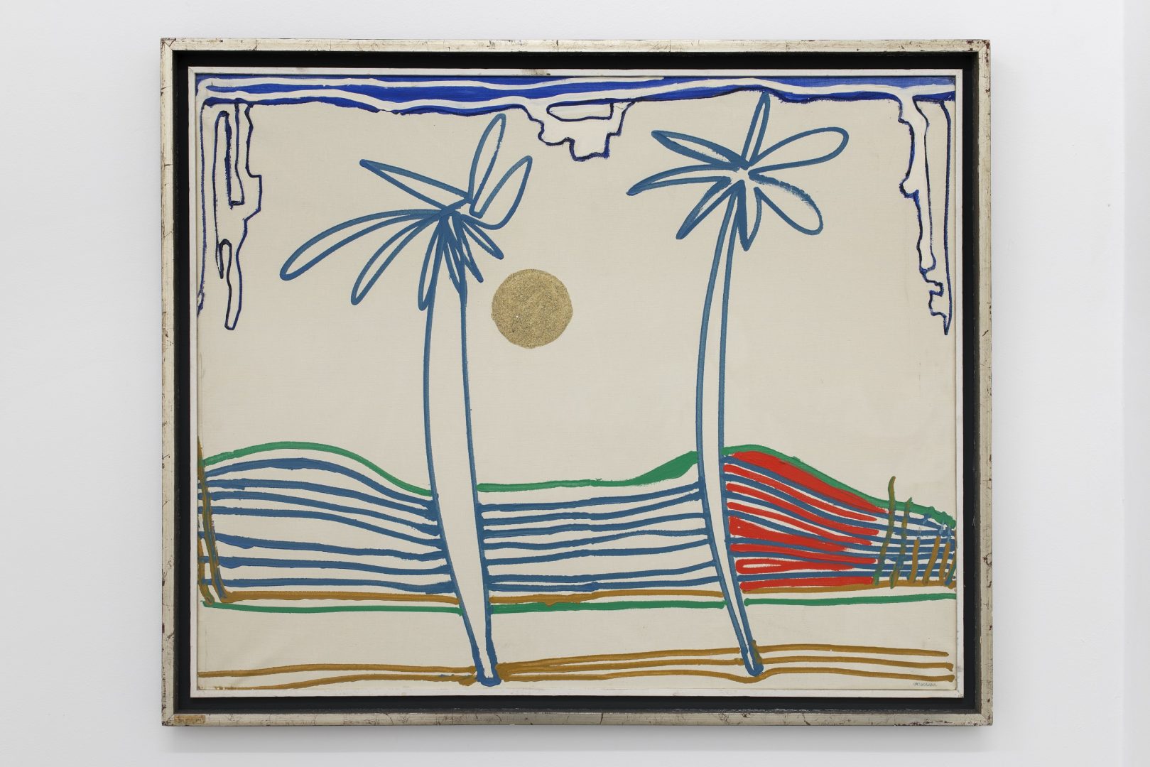
The palm trees that appear in the series of paintings in Homage to de Chirico, found their origin in works created following his stay in Cuba in 1967. Upon the initiative of the Cuban artist Wifredo Lam (to whom Gribaudo, incidentally, devotes a monograph in 1970) Ezio Gribaudo is invited by the Cuban committee to participate in the Salon de Mai 1967 in Havana and collaborate on the collective wall project of revolutionary mood, Cuba Colectiva.(8)
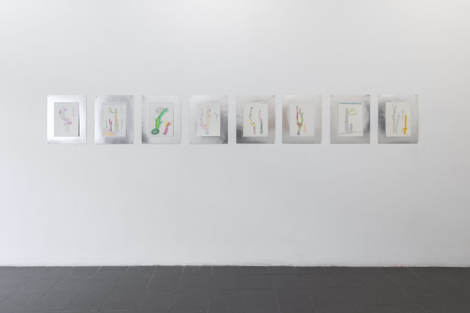
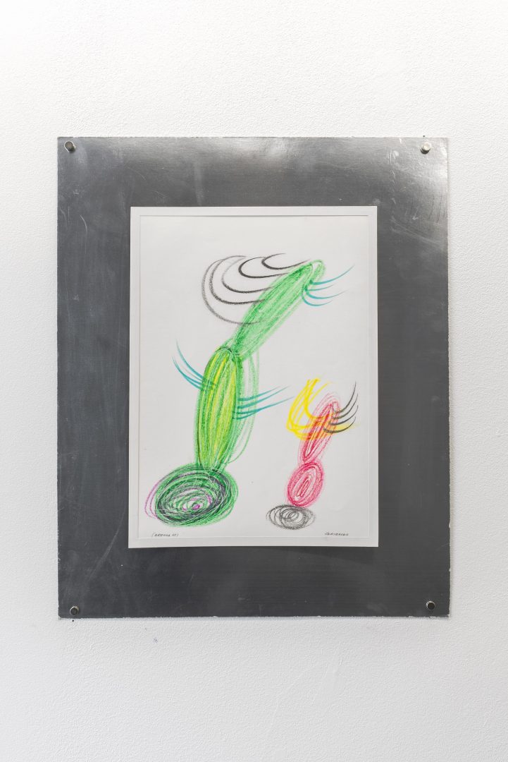
Upon his return from his Cuban journey, he develops a series of works of palm tree paintings in an equally Pop-like and graphic style in which the repetition of patterned lines seems to indicate hollow areas, colourful winks to the engraving and printing process. Also noteworthy is the very graphic appearance of the palm tree leaves (also hollow and reflecting light) that slice through the Cuban sky with their silhouettes while casting their shadows on the ground. We find these same graphic qualities in the series of cactus drawings made during his trip to Arizona in 1965.
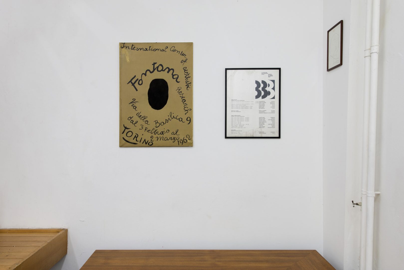
Gribaudo’s editorial adventure in the early 1960s coincides with his meeting and further collaboration with the French intellectual and art critic Michel Tapié, inventor of the concept of Art Autre (“Art Informel”) and founder of the ICAR Art center (International Center for Aesthetic Research) in Turin in 1960 for which he will produce many publications, including Devenir de Fontana, among others. This reference book reveals both Gribaudo’s deep affection for the work of the artists he used to work with, for his profession as a book architect and the sensibility with which he renders, in this case, the spatial essence of Fontana’s work with both rigor and tactility.
Almost all the books he made for Edizione d’Arte Fratelli Pozzo bring the text to the fore. Printed in large black typeface, the text becomes as much a reading experience as a visual exploration. Books designed by an artist, for artists. By the way, these are the books that led me to his work.
Ezio Gribaudo has just turned ninety. If you visit his studio, you may leave with a dinosaur drawing made in broad strokes by means of four markers of different colours, a gesture of generosity and an echo of the screen of a four-color printing process that has, once again, become manual.
Lilou Vidal
Special thanks to Paola Gribaudo and Ezio Gribaudo
1. Nebiolo, founded in 1880 in Turin by Giovanni Nebiolo, is a former Italian company specialized in the foundry of typefaces, the manufacture of printing machines and cast iron objects.
2. Letter from Pierre Alechinsky addressed to Ezio Gribaudo for a collaborative book project, 25 September, 1967.
3. The artist chose the word Logogrifo, taken from the book of the Piedmontese engraver, printer and typographer, Giambattista Bodoni “Manuel Typographique”, 1818.
4. Text of the exhibition Trent’anni di flani e logogrifi di Ezio Gribaudo, Galleria d’Arte Narciso, Turin, November, 1996.
5. Title chosen by the artist for the book Il Peso del Concreto, Edizione d’Arte Fratelli Pozzo, 1968.
6. The studio has been designed by Ezio Gribaudo and realized in collaboration with his friend and architect Andrea Bruno in 1976.
7. 194 Dessins de Giorgio de Chirico (Edizione d’Arte Fratelli Pozzo, 1968), the first work dedicated exclusively to de Chirico’s drawings from 1918 to 1967; “De Chirico Com’e”, a book of photographic portraits of de Chirico in the different places frequented by the artist in Rome, Milan and Turin (Edizione d’Arte Fratelli Pozzo, 1970); The monograph Giorgio de Chirico (Fratelli Fabbri, Les Grande Monografie, 1968).
8. The Salon de Mai of 1967- borrowing its name from the famous Paris Salon de Mai of 1945 – brought together the works of more than one hundred artists including Picasso, Calder, Magritte, Miro, Arroyo, among many others. The collective project of Mural Colectiva was initiated in Havana, on the night of July 17, by 100 Cuban and foreign artists, painters, sculptors, intellectuals (a segment of the mural was reserved for Fidel Castro, but was never filled-in by the latter). In addition to his intervention in the collective mural, Ezio Gribaudo published in 1970 the book, Mural Colectiva, Salon de Mai 1967, (Edizione d’Arte Fratelli Pozzo, 1970).